The Death of Disney Animation (Part Two of Two)
If Disney animated films begin with, “Once upon a time there was a…”
Once upon a time there was a beautiful girl fleeing from an evil queen, into the woods…
Once upon a time there was a little boy who didn’t want to grow up…
Once upon a time there was a mermaid that wanted to walk on dry land…
Once upon a time there was a hard a working girl who wanted to start a restaurant…
Then Pixar movies begin with, “What if?”
What if toys walked and talked when we aren’t looking?
What if cars lived like people in a world with no people?
What if the monster under your bed was just doing his job?
What if two elf brothers set off on a quest in modern urban setting?
“The once upon a time there was a…” Premise is just another variation on the old-school Hollywood synoptic digest of the character-driven story. “Tell me about a guy who…” And it is hardly a surprise that a guy like Walt Disney, who got his start in the business in 1923, would build his films around it.
Walt’s first animated films weren’t precisely animated films. “Alice Comedies” were a hybrid of animation and live-action.
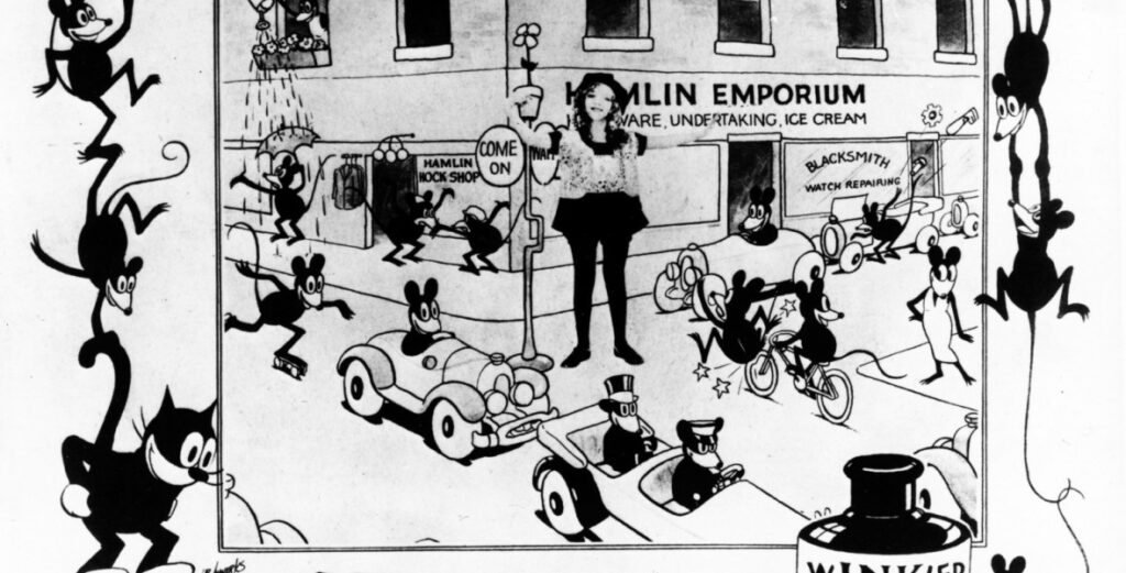
At this time, the center of the cartoon business was in New York City, but Disney had relocated to California to be near his brother Roy, who was recovering from tuberculosis in Los Angeles. Back then, this wasn’t an insane idea.
The Disney Brothers’ made (googling now, holy crap) fifty-seven Alice films in the space of four years. Walt was more than a little sick of the things when he moved on to his first animated short that didn’t star a human.
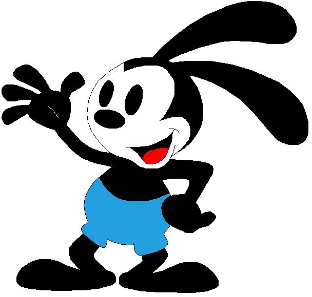
Oswald the Lucky Rabbit.
The Oswald shorts were quite successful for the Disney Brothers. Enough so that they felt they were in a position to negotiate a better deal for themselves. That was when the boys from the Mid-West found out how important it is to read the part of the contract relating to intellectual property rights.
Of which it turns out, they had none. Universal said they were happy to let Disney keep making the Oswald shorts but at lower rate. And if they didn’t like it they would just turf them and start up a new production company.
Walt said, ‘shove it,’ and walked away from his first original creation. The Disney company had nothing more to do with Oswald… Until they traded Al Michaels to get Oswald back in 2006. As a company, Disney knows how to hold a grudge.
Walt Disney vowed two things at that point. One to come with a new original IP and, two to always have better lawyers. He kept both promises.
Once upon a time, there was a mouse
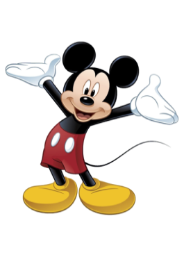
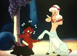
Over the next few years, Walt Disney became the innovator who set the standard in cartoons. Steamboat Willie was the first “talkie cartoon.” Flowers and Trees was the first to use the three-strip Technicolor process to create color. He also began to aim at higher themes than simple buffoonery. Goddess of Spring was a retelling of Persephone and Hades. Walt Disney kept an eye on the bottom line (okay, Roy actually did that part) but walt kept “plusing it” as he put it.
The artwork in these early pieces was in a word “noodley.” There wasn’t much in the way of straight lines. Not a surprise as this style of art had been made insanely popular by the weekly Katzenjammer Kids comic strips. Making these kinds of characters stretch and bounce like rubber was a natural extension of this aesthetic of roundness. Although, to modern eyes, it can look a little off-putting. Persephone’s tentacle-like arms in Goddess of Spring look just plain bizarre. But the dominant school of style was what it was.
Until Walt Disney rewrote it.
Snow White and the Seven Dwarves was an unheard-of gamble. A feature-length cartoon? Are you nuts? Audiences won’t sit through something that long!
The budget came in at over a million dollars, which was insane during the Depression. He nearly broke his company, his employees and himself. Almost every aspect of “Disney’s Folly” was venturing into unchartered territory. Publicity material stated that the production employed thirty-two animators, one hundred-two assistants, one hundred sixty-seven “in-betweeners,” twenty layout artists, twenty-five artists doing watercolor backgrounds, sixty-five effects animators, and one hundred fifty-eight female inkers and painters. Two million illustrations were made using one thousand five hundred shades of paint.
After it launched Dorothy Grafly remarked, ”Walt Disney has at last given the world what should have come through established art channels — the creative exploit of the animated cartoon in color, probably the first genuinely American art since that of the indigenous Indian.“
For all of its justly earned praise, Snow White was something of a bridging movie. The real advancements in art design would come from Bambi. When “noodle” limbs would be replaced with anatomically accurate limb design and joint movement. It was a new realism that had never been seen before.
Traditional Japanese landscape art heavily influenced Bambi’s background layouts.
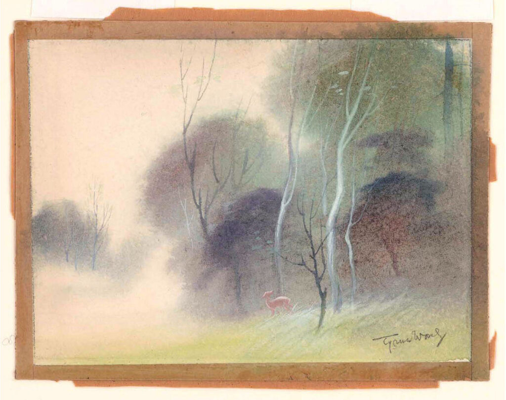
Honestly, I find the uncomplicated simplicity in Bambi’s art style preferable to the over-the-top avant-garde pretensions of Fantasia. Of the two films I know which one I would prefer to sit through.
I am not going to cover all of Walt Disney’s animated features. Which is why I’m skipping ahead to the last one that is known to have held his engagement before he began focusing on live-action films. Sleeping Beauty.
“The day Walt Disney put the first scenes from Sleeping Beauty into production, he told sequence director Eric Larson, “What we want out of this is a moving illustration. I don’t care how long it takes.” He actually meant something more specific: A moving illustration designed by painter Eyvind Earle. In one meeting, he said, “For years and years I have been hiring artists like Mary Blair to design the styling of a feature, and by the time the picture is finished, there is hardly a trace of the original styling left. This time Eyvind Earle is styling Sleeping Beauty, and that’s the way it’s going to be!”
…
“60 years after its premiere, Sleeping Beauty stands as a landmark in animation history for its singular designs and animation. The new generation of artists working at Disney, Pixar, and other studios cite Sleeping Beauty as an influence and an inspiration. Oscar-winning Pixar director Pete Docter says, ‘Eyvind Earle made great choices in the backgrounds. Most of the photos I took of the South American jungle for Up are just a mess. You can’t really tell what’s foreground and what’s background. Something we referenced from Earle’s work is how light defines where detail is. Where a streak of light crosses a tree, you’ll suddenly see this ornate bark; further up, where the trunk is in shadow, there’s less detail.’
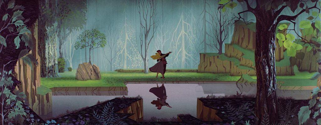
Mike Giaimo, the art director of Disney’s Frozen, explains, ‘I cut my artistic teeth on Eyvind Earle, Sleeping Beauty, 101 Dalmatians, Walt Peregoy, and Mary Blair, and the kind of color relationships they used. I call the palette in Frozen ‘jewel-like,’ and there is certainly an Earle connection: The colors are deep, rich, analogous. They don’t stray far away from each other; it’s their relationship and how they vibrate. I like hints of vibration that titillate the eye.’”
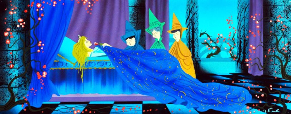
Where Snow White’s character’s costume and background designs were typical of Hollywood’s 1930s “The Adventures of Robin Hood” school (meaning a fabrication based mostly on ballet and theater costumes with little or no historical accuracy). Sleeping Beauty’s costume design and preferred color pallet were not only authentic to the medieval period but also identifiable as Germanic in origin.
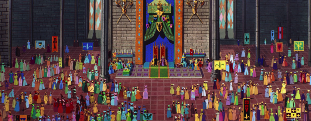
It is quite ironic that these masters of CG computer animation feel they owe so much to Eyvind Earle, as their works are so devoid of the heart Earle brought to Sleeping Beauty.
And we will be breaking off here and picking up next time in The Death of Disney Animation (Part Three of Two)

